Boxlune
Halo Module
Halo Module
Couldn't load pickup availability
Self-paced learning overview
- 📥 Digital file available after purchase
- ♾️ Long-term availability
- 🔒 Secure checkout
- 📅 Content updated in 2026
1. Problem Statement
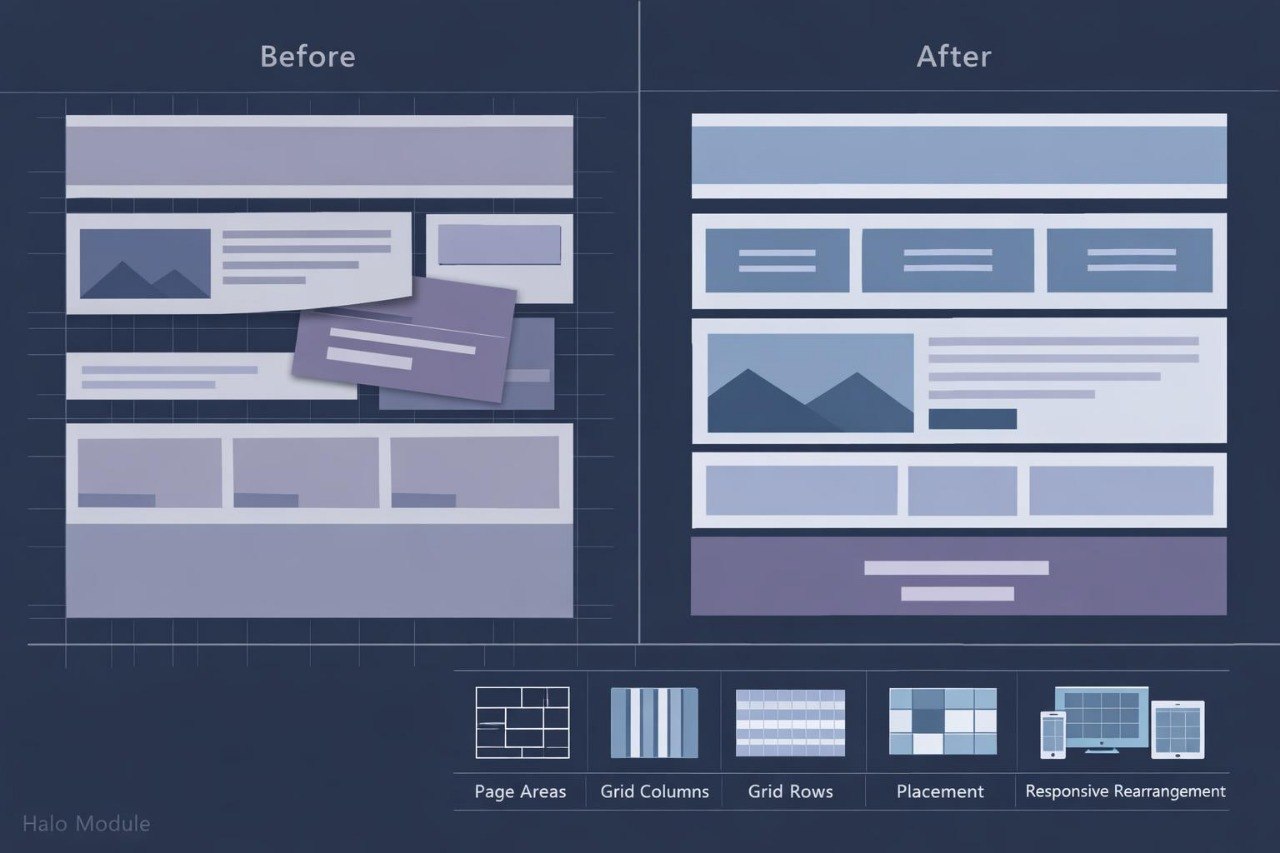
Struggling to arrange several sections so they retain a logical order and balanced proportions? You’re not alone: cards, side panels, headings, and primary content may require different widths while also spanning several rows. Creating separate positioning rules for every block often produces repeated declarations and makes later revisions more difficult. When page width changes, columns may become too narrow while gaps lose consistency. Halo Module explains how to create grid structures where each element has a defined position and understandable layout behavior.
2. Solution
This course will teach you how to create CSS grids for pages containing several types of content. You will study how columns, rows, and the spaces between them are defined. Dedicated topics explain recurring patterns, distribution of available space, and placement within named areas. Practical assignments cover galleries, information panels, card catalogs, and pages with a side section. In the final assignment, you will build a multi-section layout that adjusts its structure according to page width.
3. What’s Inside
Module 1: Grid Container Foundations
Learn how to create a grid and define its columns and rows. Examples show how child elements are placed automatically within available cells.
Module 2: Columns, Rows, and Sizing Units
Work with fixed, relative, and flexible dimensions. The module explains how several columns can divide available space without calculating every width separately.
Module 3: Recurring Structures
Learn how to define repeated columns and rows with shorter declarations. Assignments include card catalogs and galleries containing recurring blocks.
Module 4: Element Placement
Study how starting and ending grid lines control the position of individual elements. You will create blocks that span several columns or rows.
Module 5: Named Layout Areas
Build a structure containing an upper section, main content, side panel, and lower block. Named areas help keep layout declarations organized and readable.
Module 6: Automatic Grid Filling
Explore how additional cards can be positioned without separate rules for every item. Examples demonstrate layouts containing different numbers of elements.
Module 7: Structure Across Page Widths
Configure several grid arrangements for wide, medium, and narrow displays. The focus remains on readable content and a logical sequence of sections.
Module 8: Final Layout Assignment
Combine an opening area, card catalog, information panel, and closing block. You will review the grid across several widths and revise element placement where needed.
4. Who Is This For?
✅ This course may suit you if you:
- have worked with containers, spacing, and flexible rows;
- want to create multi-column pages;
- work with catalogs, galleries, or information panels;
- would like to organize detailed page sections;
- want to reduce separate positioning declarations.
❌ This course may not suit you if you:
- have not studied foundational CSS structure;
- are unfamiliar with the box model;
- are looking only for text styling materials;
- need topics outside web styling.
5. What You’ll Learn
- Create grid containers.
- Define column and row structures.
- Distribute space between page sections.
- Apply recurring layout patterns.
- Configure gaps between cells.
- Place blocks across several columns.
- Build named page areas.
- Form catalogs with different card counts.
- Reorganize a grid across several widths.
- Assemble a layout with at least five content areas.
- Identify empty or overcrowded parts of a composition.
6. 30-Day Refund Policy
A refund request may be submitted within 30 days, subject to the Boxlune store policy. The request procedure, review conditions, and possible exceptions are described on the dedicated refund policy page.
7. Certificate
After completing the required modules and final layout assignment, the learner may receive a Boxlune certificate. The document confirms completion of the Halo Module learning program.
1. How is the learning process organized?
1. How is the learning process organized?
The materials are divided into sequential modules with explanations, examples, and practical tasks. Learners can study at their own pace and revisit earlier sections for review.
2. Is previous CSS experience required?
2. Is previous CSS experience required?
The recommended background depends on the selected tier. Introductory courses explain foundational concepts, while later tiers cover broader topics, more detailed layouts, and deeper styling practices.
3. What is included in the learning materials?
3. What is included in the learning materials?
Each tier contains topic-based modules, written explanations, code examples, exercises, and final tasks. The amount and depth of the material increase according to the tier.
4. Is a certificate included?
4. Is a certificate included?
Yes. A Boxlune certificate is provided after the required modules and course assignments have been completed.
Share