Boxlune
Luma Sphere
Luma Sphere
Couldn't load pickup availability
Self-paced learning overview
- 📥 Digital file available after purchase
- ♾️ Long-term availability
- 🔒 Secure checkout
- 📅 Content updated in 2026
1. Problem Statement
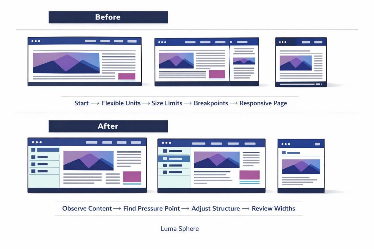
Struggling to keep a page comfortable to view across different screen sizes? You’re not alone: a layout that works well on a wide screen may create narrow columns, small text, or horizontal scrolling at a reduced width. Individual components may require different behavior, causing the stylesheet to collect overlapping or conflicting rules. Using too many breakpoints can also make future revisions difficult. Luma Sphere explains how to plan responsive behavior around content, proportions, and the logical order of page elements.
2. Solution
This course will teach you how to build responsive styling systems for multi-section web pages. You will learn how to select breakpoints according to content behavior rather than arbitrary width values. Dedicated modules cover fluid units, size constraints, responsive typography, and component restructuring. Practical assignments include navigation, cards, text sections, galleries, and forms. In the final assignment, you will create a page with several coordinated display arrangements.
3. What’s Inside
Module 1: Planning Responsive Behavior
Analyze which elements can shrink, wrap, stack, or change order. The module helps identify layout concerns before additional rules are written.
Module 2: Fluid Units and Size Constraints
Work with relative dimensions, minimum values, and maximum values. Examples show how to prevent text areas from becoming too wide and cards from becoming too narrow.
Module 3: Breakpoint Structure
Learn to add responsive rules when content begins to lose readability or balance. Assignments cover changes to column count, spacing, and layout direction.
Module 4: Responsive Typography
Coordinate text size, line height, and content width. You will create several heading and body-text levels for different viewing conditions.
Module 5: Images and Media Blocks
Configure proportions, cropping, and scaling for images inside cards and page sections. The module also examines visual blocks placed within narrow containers.
Module 6: Navigation and Form Reorganization
Adjust navigation items, buttons, labels, and fields across several widths. The focus remains on order, spacing, and clear grouping.
Module 7: Responsive Cards and Grids
Create a card section that moves from several columns to a more compact arrangement. The assignment includes control over minimum card width.
Module 8: Layout Review
Conduct a structured review at wide, medium, and narrow widths. The module includes checks for text, images, spacing, overflow, and component behavior.
Module 9: Final Responsive Page
Combine an opening section, information areas, cards, a form, and a closing region. The final assignment includes at least three structural display arrangements.
4. Who Is This For?
✅ This course may suit you if you:
- already work with flexible containers and grids;
- want to build layouts for different screen widths;
- would like to plan breakpoints more carefully;
- work with cards, forms, and images;
- want to organize responsive rules more clearly.
❌ This course may not suit you if you:
- have not yet studied CSS foundations;
- are unfamiliar with containers and the box model;
- need materials outside web styling;
- are looking only for introductory text formatting.
5. What You’ll Learn
- Identify layout concerns caused by width changes.
- Select breakpoints according to content behavior.
- Use fluid sizing units.
- Apply minimum and maximum size constraints.
- Reorganize rows, columns, and grids.
- Build a responsive typography scale.
- Configure images within containers of different proportions.
- Adjust navigation and form structures.
- Create card sections with several arrangements.
- Review a page at no fewer than three widths.
- Reduce overlapping responsive declarations.
6. 30-Day Refund Policy
A refund request may be submitted within 30 days, subject to the Boxlune store policy. The request procedure, review conditions, and possible exceptions are described on the dedicated refund policy page.
7. Certificate
After completing the required modules and final responsive page assignment, the learner may receive a Boxlune certificate. The document confirms completion of the Luma Sphere learning program.
1. How is the learning process organized?
1. How is the learning process organized?
The materials are divided into sequential modules with explanations, examples, and practical tasks. Learners can study at their own pace and revisit earlier sections for review.
2. Is previous CSS experience required?
2. Is previous CSS experience required?
The recommended background depends on the selected tier. Introductory courses explain foundational concepts, while later tiers cover broader topics, more detailed layouts, and deeper styling practices.
3. What is included in the learning materials?
3. What is included in the learning materials?
Each tier contains topic-based modules, written explanations, code examples, exercises, and final tasks. The amount and depth of the material increase according to the tier.
4. Is a certificate included?
4. Is a certificate included?
Yes. A Boxlune certificate is provided after the required modules and course assignments have been completed.
Share