Boxlune
Vertex Library
Vertex Library
Couldn't load pickup availability
Self-paced learning overview
- 📥 Digital file available after purchase
- ♾️ Long-term availability
- 🔒 Secure checkout
- 📅 Content updated in 2026
1. Problem Statement
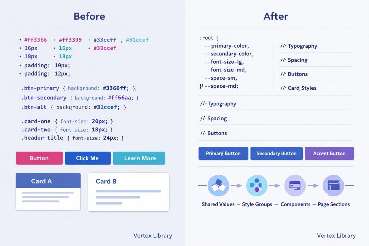
Struggling to maintain consistent styling when a web page contains many sections and recurring elements? You’re not alone: the same colors, spacing values, buttons, and cards are often described several times across a stylesheet. As a result, one small revision may require changes in many separate rules. Similar components can gradually develop different dimensions, borders, or text settings. Vertex Library explains how to organize styles into a connected library with recurring values, understandable naming, and a predictable structure.
2. Solution
This course will teach you how to form a style library for related web elements. You will learn how to store recurring colors, spacing values, dimensions, and borders in CSS variables. Dedicated modules explain typography scales, spacing systems, and component groups. Practical assignments cover buttons, cards, notices, form fields, and navigation elements. In the final assignment, you will assemble a compact style library and apply it to a multi-section page.
3. What’s Inside
Module 1: Style Library Structure
Determine which rules belong to base settings, layouts, components, and utility classes. The module explains how to group styles according to their purpose.
Module 2: CSS Variables
Create variables for colors, spacing, corner radius, borders, and text sizes. Examples demonstrate how several related elements can be revised by editing one shared value.
Module 3: Color System
Form primary, supporting, and neutral color groups. Dedicated examples cover backgrounds, text, borders, and interaction states.
Module 4: Typography Scale
Work with headings, body text, captions, and supporting labels. You will configure sizes, line spacing, and text weight for several content levels.
Module 5: Spacing and Sizing System
Create recurring values for margins and padding. Assignments help establish a coordinated rhythm between page sections and components.
Module 6: Button and Label Library
Style several button, label, and compact information element variations. Topics include dimensions, borders, backgrounds, and interaction states.
Module 7: Cards and Information Blocks
Build recurring card structures with headings, descriptions, and supporting areas. You will also create notices and topic-based panels.
Module 8: Fields and Form Elements
Study the styling of text fields, labels, selection controls, and input states. You will coordinate dimensions and spacing across a group of fields.
Module 9: Utility Classes
Create a small group of classes for alignment, spacing, width, and display behavior. The module also explains which rules should remain within individual components.
Module 10: Final Style Library
Combine variables, typography, buttons, cards, and form elements into one organized system. You will then apply the library to a page containing several connected sections.
4. Who Is This For?
✅ This course may suit you if you:
- already create layouts with rows, columns, and grids;
- want to reduce repetition in CSS;
- work with recurring components across several pages;
- would like to organize colors, spacing, and typography;
- want to create styles that are simpler to revise.
❌ This course may not suit you if you:
- have not yet studied selectors and the box model;
- are looking only for introductory CSS explanations;
- do not plan to work with recurring components;
- need materials outside web styling.
5. What You’ll Learn
- Group CSS rules by function.
- Create a reusable set of CSS variables.
- Form a color system containing at least three groups.
- Configure a typography scale for headings and body text.
- Build a coordinated spacing system.
- Style several button and label variations.
- Create recurring cards and information blocks.
- Apply shared rules to groups of form fields.
- Reduce repeated values across a stylesheet.
- Assemble a library containing at least ten components.
- Revise several page sections through shared variable changes.
6. 30-Day Refund Policy
A refund request may be submitted within 30 days, subject to the Boxlune store policy. The request conditions, review procedure, and possible exceptions are described on the refund policy page.
7. Certificate
After completing the required modules and final style library assignment, the learner may receive a Boxlune certificate. The document confirms completion of the Vertex Library learning program.
1. How is the learning process organized?
1. How is the learning process organized?
The materials are divided into sequential modules with explanations, examples, and practical tasks. Learners can study at their own pace and revisit earlier sections for review.
2. Is previous CSS experience required?
2. Is previous CSS experience required?
The recommended background depends on the selected tier. Introductory courses explain foundational concepts, while later tiers cover broader topics, more detailed layouts, and deeper styling practices.
3. What is included in the learning materials?
3. What is included in the learning materials?
Each tier contains topic-based modules, written explanations, code examples, exercises, and final tasks. The amount and depth of the material increase according to the tier.
4. Is a certificate included?
4. Is a certificate included?
Yes. A Boxlune certificate is provided after the required modules and course assignments have been completed.
Share